
A data science project can offer a lot more than just a machine learning model. Understanding how the business processes are represented in the data, and what a model can learn from the data is of equal importance as the model predictions. Some of the hidden insight in your data can only be uncovered when the story behind the predictions of the model is understood. This can only be achieved with additional tools (i.e., algorithms). Many new tools for that purpose are currently being developed in the machine learning community.
In this Blog post we introduce a relatively new algorithm for model interpretability, and for which our data science team has just released a Python implementation (PyPi and github).
Data Science: Beyond a Machine Learning model
Interpreting an ML model with ALE plots
The product of a usual data science project is often thought of as a machine learning model that uses historical data to predict specific future events, e.g., the customers which are likely to leave within the next month, or the quality of a product at the end of a production line. However, a company that newly dives into the adventure of a DataScience project soon realizes that the outcome of the process of developing the model is equally important as the ML model, if not even more. During this process we gain a better understanding of the data, and therefore we can better explain how the business is represented in the data.
We found that it is very common for a client to underestimate the importance of the phase of data exploration and data understanding, and our clients are often positively surprised of the amount of insight they gain about their data – and subsequently their business – during the process of developing the model, it is even possible to see this knowledge translated into action by the decision makers, long before training a machine learning model. One could say that the output of a good data science project is insight before the model.
Because we – data scientists – see that insight should be the main output of every project, it is especially important to be able not only to interpret the predictions of the model, but also to understand the story behind these predictions and what the model has learned from the data.
Model interpretability is important for building trust and a sense of reliability between the data scientist and the client. In some cases, interpretability is not the byproduct but the product itself, for example, when the client wants to know why a customer would leave (instead of which customers are leaving soon), or which parts of the production line affect the quality of the product (instead of what is the quality of the end-product). One could even argue that the answers to these questions, resulting in understanding the inner processes better, would have more value than solving the specific use case that the model is intended for.
While some machine learning models offer interpretability by design, others are still considered black-box algorithms, and to better understand the inner workings of such algorithms, we use additional tools (i.e., algorithms) to peek into that box.
The tool we are presenting here is the Accumulated Local Effects plot a.k.a. ALE plot. These plots show us how the changes in a feature affect the prediction of the model. In comparison with similar algorithms (like Partial Dependence Plot a.k.a. PDP) it is faster and is more trusted when handling correlated features.
One of our recent projects was to see how non-pharmaceutical measures affect the growth rate of COVID-19 and how long it takes for a measure to show its effect. Our plan was to use ALE plots, and when considering which language to use for the analysis we went for R, mainly because the algorithm was already implemented in the package ALEPlot. However, we also frequently use Python, and it seemed like we would eventually need a Python implementation of the algorithm in future projects, so it was decided to translate the R implementation to Python, which eventually led to releasing the Python package PyALE.
This side project was not only a great way to better understand the algorithm, but it enabled us to add extra features, which we felt were needed when we used the R implementation.
To present PyALE and better understand ALE plots we use the following example use case.
The data we are using in this demo is the Diamond dataset, an open-source dataset that comes with the R package ggplot2. The dataset contains prices and features of more than 50000 diamonds, and looks something like this:

We train a model (in this example we use a random forest) to predict the price of diamonds from the attributes. The model we got can predict the prices of diamonds with an average percentage error of about 6.8 % (MAPE) on the test set, which is good enough for our purposes. However, no matter how good the model gets, it would be quite interesting to see what the model learned from the data, how each feature affects the prediction of the model. And this is where the ALE plots come in.
We shall import the generic function “ale” from the package PyALE and choose two features to analyze their effects on the prediction.
from PyALE import aleUnless specifically chosen, the function “ale” automatically detects the type of the feature, and if the parameter “plot” is set to true – which is the default behavior – the function plots the returned values of the estimated effects.
The first feature is the carat, which is a numeric continuous feature, hence, we will set “feature_type” to „continuous“. One of the additional features in the package – compared to the R implementation – is the ability to compute the confidence interval of the estimated effect. In the following we use a sample of 1000 data points from our data to see how the confidence interval tightens in the areas with dense data points.
ale_eff = ale(X=X_sample,
          model=model,
          feature=['carat'],
          feature_type='continuous',
          grid_size=50,
          include_CI=True,
C=0.95) 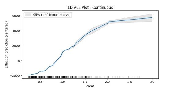
What we need to see in the plot is the difference in the y-axis between two points on the x-axis, for example one can say that when the carat increases from around 0.5 to 1 then the prediction value of the model increases on average about 2500 USD (intuitively this means: the model has learned that an increase of half a carat is worth on average 2500 USD).
Of course, not all features are numerical, for example the feature “cut” has five categories „Fair“, „Good“, „Very Good“, „Premium“, and „Ideal“, since computers do not understand text, we need to encode such features numerically. With this data we are in luck because the categories have a natural ordering (for example from worse to best), which is why it is a good idea to use natural numbers to encode them, mainly the numbers from 0 to 4, having 0 as „Fair“ and 4 as „Ideal“.
Again, we use the same function, giving it the feature name „cut“ and the type „discrete“ to tell the algorithm that these values should be thought of as categories.
ale_eff = ale(X= X_sample,
          model=model,
          feature=['cut'],
          feature_type='discrete',
          include_CI=True,
C=0.95) 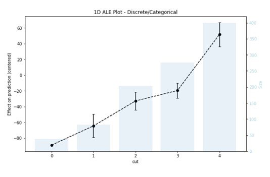
This time the plot we get is a bar plot representing the number of data points in each category, and a line for the estimated effects with error bars indicating the confidence interval of the estimation. But the interpretation is still the same, and what interests us is the difference in the values between the different categories. For example, the predicted price increases by 45 USD on average when the cut increases from 1 (i.e., good) to 3 (i.e., premium).
While reading this you might think: “But what about attributes that do not have a natural ordering?” No worries, we’ve got you covered. An additional feature was recently released, with version 1.1.0, that enables the user to plot the effects of a categorical attribute which have a special encoding function. With this feature the package will assign an ordering to the categories of the attribute based on their similarities and will use the special encoding function provided by the user. The full code with additional example plots can be found here.
As for a takeaway of this piece, for those of you in the data science/developing business, you have now a new interpretability tool PyALE in your python package index. Please feel free to explore and test the package, and file your issues on our github page.
For those of you in the decision-making business, any data science project in your company will allow you to explore your business through your data, which is for many a new perspective that could lead to a new and exciting insight, and which will be a step towards data-driven decisions.
So, enjoy the ride!
Pic from Technology vector created by vectorjuice – www.freepik.com


